Grid like entry with autosave

Previous Topic Next Topic
 
classic Classic list List threaded Threaded
9 messages Options
Reply | Threaded
Open this post in threaded view
|

Grid like entry with autosave

Sanjay Minni
Hi,

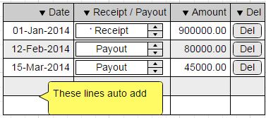
I want to make a grid like entry widget on a collection with auto save (say like excel / google sheets behaves). pls advice on how to go about the UI. I looked as the examples - Forms where to add / delete a separate sub screen comes on - that is not what I am looking for.
   
Simply put it has a date, a symbol / text  and an amount
i should be able to edit inline, keep adding at end, or delete a link / button at end of each line


thanks
Sanjay
cheers,
Sanjay
Reply | Threaded
Open this post in threaded view
|

Re: Grid like entry with autosave

Sanjay Minni
I have some basic questions while trying to code for a UI below

        html table: [  
                self transactions dataLines do: [ :tr |
                        html tableRow: [
                                html tableData: <code here for date>
                                html tableData: <code here for receipt / payout indicator >
                                html tableData: [  
                                        html textInput value: [:value | tr amount: value]; with: tr amount. ].
                                html tableData: [
                                        html anchor callback: [ self removeTransaction: tr ]; with: 'delete'.  ].
                                ].
                        ].
                ].

Questions given the display will be as per below :
1. which is the best brush to use for date in this case
2. which brush to use for amount - this is financial amount usually 2 or 3 decimals, right justified and the digits are comma ',' separated and should I use a float in the model (Using Pharo 4)
3. what is the usual method to get empty lines below - else I will have to code for an 'add' button
4. most important - ... so far ... this is not part of a form - what brushes / tags should I use if the parent will be a form (there will be other parts in the screen above, below and aside the part below

thanks
Sanjay


Sanjay Minni wrote
Hi,

I want to make a grid like entry widget on a collection with auto save (say like excel / google sheets behaves). pls advice on how to go about the UI. I looked as the examples - Forms where to add / delete a separate sub screen comes on - that is not what I am looking for.
   
Simply put it has a date, a symbol / text  and an amount
i should be able to edit inline, keep adding at end, or delete a link / button at end of each line


thanks
Sanjay
cheers,
Sanjay
Reply | Threaded
Open this post in threaded view
|

Re: Grid like entry with autosave

Sanjay Minni
Hi ... please help me here ...

Sanjay Minni wrote
I have some basic questions while trying to code for a UI below

        html table: [  
                self transactions dataLines do: [ :tr |
                        html tableRow: [
                                html tableData: <code here for date>
                                html tableData: <code here for receipt / payout indicator >
                                html tableData: [  
                                        html textInput value: [:value | tr amount: value]; with: tr amount. ].
                                html tableData: [
                                        html anchor callback: [ self removeTransaction: tr ]; with: 'delete'.  ].
                                ].
                        ].
                ].

Questions given the display will be as per below :
1. which is the best brush to use for date in this case
2. which brush to use for amount - this is financial amount usually 2 or 3 decimals, right justified and the digits are comma ',' separated and should I use a float in the model (Using Pharo 4)
3. what is the usual method to get empty lines below - else I will have to code for an 'add' button
4. most important - ... so far ... this is not part of a form - what brushes / tags should I use if the parent will be a form (there will be other parts in the screen above, below and aside the part below

thanks
Sanjay
 

Sanjay Minni wrote
Hi,

I want to make a grid like entry widget on a collection with auto save (say like excel / google sheets behaves). pls advice on how to go about the UI. I looked as the examples - Forms where to add / delete a separate sub screen comes on - that is not what I am looking for.
   
Simply put it has a date, a symbol / text  and an amount
i should be able to edit inline, keep adding at end, or delete a link / button at end of each line


thanks
Sanjay
cheers,
Sanjay
Reply | Threaded
Open this post in threaded view
|

Re: Grid like entry with autosave

Stephan Eggermont-3
In reply to this post by Sanjay Minni
You'll need some javascript for that, handling arrow down, right, tab, enter
to do the right thing at the end of the table (insert a row, put the focus at the right field).

Stephan_______________________________________________
seaside mailing list
[hidden email]
http://lists.squeakfoundation.org/cgi-bin/mailman/listinfo/seaside
Reply | Threaded
Open this post in threaded view
|

Re: Grid like entry with autosave

Johan Brichau-2
In reply to this post by Sanjay Minni
Hi Sanjay,

Mind that a Seaside brush only determines the html element that gets rendered. If you want to render a date, there is no html element that is ‘best’ to use (and hence no brush that is best to use).
Most of the time, a date will be rendered as text, but possibly you want to render some more markup to allow styling via css (i.e. adding css classes). If you want to render the date in an input field, mind that html5 does define a ‘date’ type, but the state of the implementation in current browsers is limited [1]. 

A word of advice: if you manipulate financial data, do not use Floats but Fractions (or ScaledDecimal). Even if the customer says it should not be that precise, do not use Floats.

If you want to get going, try to render all textInputs in the table.
Next, use jQuery and add the serialization of the text input field on change:

html textInput
onChange: (html jQuery this serializeThis);
callback: [:val | … ];
with: value

Set anchors for adding lines, removing lines, etc.. 
This will give you a functional page.

Now, once the table becomes large or you want snappier client-side behaviour, you will need to step into more javascript and ajax for adding lines, removing lines.
Eventually, you will need to use event delegation rather than add a change script to every text input (because the page will become too large).

Just go in steps. Iterate and learn new things.

Hope this helps
Johan


On 08 Jan 2015, at 18:06, Sanjay Minni <[hidden email]> wrote:

I have some basic questions while trying to code for a UI below

html table: [  
self transactions dataLines do: [ :tr |
html tableRow: [
html tableData: <code here for date>
html tableData: <code here for receipt / payout indicator >
html tableData: [  
html textInput value: [:value | tr amount: value]; with: tr amount. ].
html tableData: [ 
html anchor callback: [ self removeTransaction: tr ]; with: 'delete'. 
].
]. 
]. 
].

Questions given the display will be as per below :
1. which is the best brush to use for date in this case
2. which brush to use for amount - this is financial amount usually 2 or 3
decimals, right justified and the digits are comma ',' separated and should
I use a float in the model (Using Pharo 4)
3. what is the usual method to get empty lines below - else I will have to
code for an 'add' button
4. most important - ... so far ... this is not part of a form - what brushes
/ tags should I use if the parent will be a form (there will be other parts
in the screen above, below and aside the part below

thanks
Sanjay


Sanjay Minni wrote
Hi,

I want to make a grid like entry widget on a collection with auto save
(say like excel / google sheets behaves). pls advice on how to go about
the UI. I looked as the examples - Forms where to add / delete a separate
sub screen comes on - that is not what I am looking for.

Simply put it has a date, a symbol / text  and an amount
i should be able to edit inline, keep adding at end, or delete a link /
button at end of each line
<http://forum.world.st/file/n4798280/GridScreenMockup.jpg> 

thanks
Sanjay


-----
---
Regards, Sanjay
--
View this message in context: http://forum.world.st/Grid-like-entry-with-autosave-tp4798280p4798406.html
Sent from the Seaside General mailing list archive at Nabble.com.
_______________________________________________
seaside mailing list
[hidden email]
http://lists.squeakfoundation.org/cgi-bin/mailman/listinfo/seaside


_______________________________________________
seaside mailing list
[hidden email]
http://lists.squeakfoundation.org/cgi-bin/mailman/listinfo/seaside
Reply | Threaded
Open this post in threaded view
|

Re: Grid like entry with autosave

Sanjay Minni
Thanks Johan,

let me digest this ... My focus was input fields

- Date input if possible templated as 'dd/mm/yyyy' (a picker only to popup when the field is in focus)
- an amount input field as 999,999,999.00 right justified
(in India we also have 99,99,999.00) and in some countries / currencies / inventory quantities etc 3 digits after the decimal is required and should stop at that i.e. no inputs on overflow

regards  
Sanjay

Johan Brichau-2 wrote
Hi Sanjay,

Mind that a Seaside brush only determines the html element that gets rendered. If you want to render a date, there is no html element that is ‘best’ to use (and hence no brush that is best to use).
Most of the time, a date will be rendered as text, but possibly you want to render some more markup to allow styling via css (i.e. adding css classes). If you want to render the date in an input field, mind that html5 does define a ‘date’ type, but the state of the implementation in current browsers is limited [1].

A word of advice: if you manipulate financial data, do not use Floats but Fractions (or ScaledDecimal). Even if the customer says it should not be that precise, do not use Floats.

If you want to get going, try to render all textInputs in the table.
Next, use jQuery and add the serialization of the text input field on change:

html textInput
        onChange: (html jQuery this serializeThis);
        callback: [:val | … ];
        with: value

Set anchors for adding lines, removing lines, etc..
This will give you a functional page.

Now, once the table becomes large or you want snappier client-side behaviour, you will need to step into more javascript and ajax for adding lines, removing lines.
Eventually, you will need to use event delegation rather than add a change script to every text input (because the page will become too large).

Just go in steps. Iterate and learn new things.

Hope this helps
Johan

[1] http://caniuse.com/#search=date


> On 08 Jan 2015, at 18:06, Sanjay Minni <[hidden email]> wrote:
>
> I have some basic questions while trying to code for a UI below
>
> html table: [  
> self transactions dataLines do: [ :tr |
> html tableRow: [
> html tableData: <code here for date>
> html tableData: <code here for receipt / payout indicator >
> html tableData: [  
> html textInput value: [:value | tr amount: value]; with: tr amount. ].
> html tableData: [
> html anchor callback: [ self removeTransaction: tr ]; with: 'delete'.
> ].
> ].
> ].
> ].
>
> Questions given the display will be as per below :
> 1. which is the best brush to use for date in this case
> 2. which brush to use for amount - this is financial amount usually 2 or 3
> decimals, right justified and the digits are comma ',' separated and should
> I use a float in the model (Using Pharo 4)
> 3. what is the usual method to get empty lines below - else I will have to
> code for an 'add' button
> 4. most important - ... so far ... this is not part of a form - what brushes
> / tags should I use if the parent will be a form (there will be other parts
> in the screen above, below and aside the part below
>
> thanks
> Sanjay
>
>
>
>
>
>
> Sanjay Minni wrote
>> Hi,
>>
>> I want to make a grid like entry widget on a collection with auto save
>> (say like excel / google sheets behaves). pls advice on how to go about
>> the UI. I looked as the examples - Forms where to add / delete a separate
>> sub screen comes on - that is not what I am looking for.
>>
>> Simply put it has a date, a symbol / text  and an amount
>> i should be able to edit inline, keep adding at end, or delete a link /
>> button at end of each line
> <http://forum.world.st/file/n4798280/GridScreenMockup.jpg> 
>>
>> thanks
>> Sanjay
>
>
>
>
>
> -----
> ---
> Regards, Sanjay
> --
> View this message in context: http://forum.world.st/Grid-like-entry-with-autosave-tp4798280p4798406.html <http://forum.world.st/Grid-like-entry-with-autosave-tp4798280p4798406.html>
> Sent from the Seaside General mailing list archive at Nabble.com <http://nabble.com/>.
> _______________________________________________
> seaside mailing list
> [hidden email] <mailto:[hidden email]>
> http://lists.squeakfoundation.org/cgi-bin/mailman/listinfo/seaside <http://lists.squeakfoundation.org/cgi-bin/mailman/listinfo/seaside>

_______________________________________________
seaside mailing list
[hidden email]
http://lists.squeakfoundation.org/cgi-bin/mailman/listinfo/seaside
cheers,
Sanjay
Reply | Threaded
Open this post in threaded view
|

Re: Grid like entry with autosave

Sanjay Minni
Hi

as of now I am putting a quick solution using simple forms
I have put an anchor with callback to del each line and an anchor at and to add a line (and a new row is displayed and the anchor goes below that)

however the del and and add anchor do not save any changes that have been done

Ques: - how can I implicitly save the form in the delete and add links before proceeding to the action

regards
Sanjay

Sanjay Minni wrote
Thanks Johan,

let me digest this ... My focus was input fields

- Date input if possible templated as 'dd/mm/yyyy' (a picker only to popup when the field is in focus)
- an amount input field as 999,999,999.00 right justified
(in India we also have 99,99,999.00) and in some countries / currencies / inventory quantities etc 3 digits after the decimal is required and should stop at that i.e. no inputs on overflow

regards  
Sanjay

Johan Brichau-2 wrote
Hi Sanjay,

Mind that a Seaside brush only determines the html element that gets rendered. If you want to render a date, there is no html element that is ‘best’ to use (and hence no brush that is best to use).
Most of the time, a date will be rendered as text, but possibly you want to render some more markup to allow styling via css (i.e. adding css classes). If you want to render the date in an input field, mind that html5 does define a ‘date’ type, but the state of the implementation in current browsers is limited [1].

A word of advice: if you manipulate financial data, do not use Floats but Fractions (or ScaledDecimal). Even if the customer says it should not be that precise, do not use Floats.

If you want to get going, try to render all textInputs in the table.
Next, use jQuery and add the serialization of the text input field on change:

html textInput
        onChange: (html jQuery this serializeThis);
        callback: [:val | … ];
        with: value

Set anchors for adding lines, removing lines, etc..
This will give you a functional page.

Now, once the table becomes large or you want snappier client-side behaviour, you will need to step into more javascript and ajax for adding lines, removing lines.
Eventually, you will need to use event delegation rather than add a change script to every text input (because the page will become too large).

Just go in steps. Iterate and learn new things.

Hope this helps
Johan

[1] http://caniuse.com/#search=date


> On 08 Jan 2015, at 18:06, Sanjay Minni <[hidden email]> wrote:
>
> I have some basic questions while trying to code for a UI below
>
> html table: [  
> self transactions dataLines do: [ :tr |
> html tableRow: [
> html tableData: <code here for date>
> html tableData: <code here for receipt / payout indicator >
> html tableData: [  
> html textInput value: [:value | tr amount: value]; with: tr amount. ].
> html tableData: [
> html anchor callback: [ self removeTransaction: tr ]; with: 'delete'.
> ].
> ].
> ].
> ].
>
> Questions given the display will be as per below :
> 1. which is the best brush to use for date in this case
> 2. which brush to use for amount - this is financial amount usually 2 or 3
> decimals, right justified and the digits are comma ',' separated and should
> I use a float in the model (Using Pharo 4)
> 3. what is the usual method to get empty lines below - else I will have to
> code for an 'add' button
> 4. most important - ... so far ... this is not part of a form - what brushes
> / tags should I use if the parent will be a form (there will be other parts
> in the screen above, below and aside the part below
>
> thanks
> Sanjay
>
>
>
>
>
>
> Sanjay Minni wrote
>> Hi,
>>
>> I want to make a grid like entry widget on a collection with auto save
>> (say like excel / google sheets behaves). pls advice on how to go about
>> the UI. I looked as the examples - Forms where to add / delete a separate
>> sub screen comes on - that is not what I am looking for.
>>
>> Simply put it has a date, a symbol / text  and an amount
>> i should be able to edit inline, keep adding at end, or delete a link /
>> button at end of each line
> <http://forum.world.st/file/n4798280/GridScreenMockup.jpg> 
>>
>> thanks
>> Sanjay
>
>
>
>
>
> -----
> ---
> Regards, Sanjay
> --
> View this message in context: http://forum.world.st/Grid-like-entry-with-autosave-tp4798280p4798406.html <http://forum.world.st/Grid-like-entry-with-autosave-tp4798280p4798406.html>
> Sent from the Seaside General mailing list archive at Nabble.com <http://nabble.com/>.
> _______________________________________________
> seaside mailing list
> [hidden email] <mailto:[hidden email]>
> http://lists.squeakfoundation.org/cgi-bin/mailman/listinfo/seaside <http://lists.squeakfoundation.org/cgi-bin/mailman/listinfo/seaside>

_______________________________________________
seaside mailing list
[hidden email]
http://lists.squeakfoundation.org/cgi-bin/mailman/listinfo/seaside
cheers,
Sanjay
Reply | Threaded
Open this post in threaded view
|

Re: Grid like entry with autosave

Johan Brichau-2
Sanjay,

I don’t fully understand what you mean with ‘save any changes’ or ‘save the form’.
Perhaps it’s best if you also post your code of the anchors and their callbacks.

Johan

On 11 Jan 2015, at 08:46, Sanjay Minni <[hidden email]> wrote:

Hi

as of now I am putting a quick solution using simple forms
I have put an anchor with callback to del each line and an anchor at and to
add a line (and a new row is displayed and the anchor goes below that)

however the del and and add anchor do not save any changes that have been
done 

Ques: - how can I implicitly save the form in the delete and add links
before proceeding to the action

regards
Sanjay


Sanjay Minni wrote
Thanks Johan,

let me digest this ... My focus was input fields

- Date input if possible templated as 'dd/mm/yyyy' (a picker only to popup
when the field is in focus)
- an amount input field as 999,999,999.00 right justified 
(in India we also have 99,99,999.00) and in some countries / currencies /
inventory quantities etc 3 digits after the decimal is required and should
stop at that i.e. no inputs on overflow

regards  
Sanjay
Johan Brichau-2 wrote
Hi Sanjay,

Mind that a Seaside brush only determines the html element that gets
rendered. If you want to render a date, there is no html element that is
‘best’ to use (and hence no brush that is best to use).
Most of the time, a date will be rendered as text, but possibly you want
to render some more markup to allow styling via css (i.e. adding css
classes). If you want to render the date in an input field, mind that
html5 does define a ‘date’ type, but the state of the implementation in
current browsers is limited [1]. 

A word of advice: if you manipulate financial data, do not use Floats but
Fractions (or ScaledDecimal). Even if the customer says it should not be
that precise, do not use Floats.

If you want to get going, try to render all textInputs in the table.
Next, use jQuery and add the serialization of the text input field on
change:

html textInput
onChange: (html jQuery this serializeThis);
callback: [:val | … ];
with: value

Set anchors for adding lines, removing lines, etc.. 
This will give you a functional page.

Now, once the table becomes large or you want snappier client-side
behaviour, you will need to step into more javascript and ajax for adding
lines, removing lines.
Eventually, you will need to use event delegation rather than add a
change script to every text input (because the page will become too
large).

Just go in steps. Iterate and learn new things.

Hope this helps
Johan

[1] http://caniuse.com/#search=date


On 08 Jan 2015, at 18:06, Sanjay Minni &lt;

sm@

&gt; wrote:

I have some basic questions while trying to code for a UI below

html table: [  
self transactions dataLines do: [ :tr |
html tableRow: [
html tableData: 
<code here for date>
html tableData: 
<code here for receipt / payout indicator >
html tableData: [  
html textInput value: [:value | tr amount: value]; with: tr amount.
].
html tableData: [ 
html anchor callback: [ self removeTransaction: tr ]; with:
'delete'. 
].
]. 
]. 
].

Questions given the display will be as per below :
1. which is the best brush to use for date in this case
2. which brush to use for amount - this is financial amount usually 2 or
3
decimals, right justified and the digits are comma ',' separated and
should
I use a float in the model (Using Pharo 4)
3. what is the usual method to get empty lines below - else I will have
to
code for an 'add' button
4. most important - ... so far ... this is not part of a form - what
brushes
/ tags should I use if the parent will be a form (there will be other
parts
in the screen above, below and aside the part below

thanks
Sanjay


Sanjay Minni wrote
Hi,

I want to make a grid like entry widget on a collection with auto save
(say like excel / google sheets behaves). pls advice on how to go about
the UI. I looked as the examples - Forms where to add / delete a
separate
sub screen comes on - that is not what I am looking for.

Simply put it has a date, a symbol / text  and an amount
i should be able to edit inline, keep adding at end, or delete a link /
button at end of each line
&lt;http://forum.world.st/file/n4798280/GridScreenMockup.jpg&gt; 

thanks
Sanjay


-----
---
Regards, Sanjay
--
View this message in context:
http://forum.world.st/Grid-like-entry-with-autosave-tp4798280p4798406.html
&lt;http://forum.world.st/Grid-like-entry-with-autosave-tp4798280p4798406.html&gt;
Sent from the Seaside General mailing list archive at Nabble.com
&lt;http://nabble.com/&gt;.
_______________________________________________
seaside mailing list


seaside@.squeakfoundation

&lt;mailto:

seaside@.squeakfoundation

&gt;
http://lists.squeakfoundation.org/cgi-bin/mailman/listinfo/seaside
&lt;http://lists.squeakfoundation.org/cgi-bin/mailman/listinfo/seaside&gt;

_______________________________________________
seaside mailing list

seaside@.squeakfoundation

http://lists.squeakfoundation.org/cgi-bin/mailman/listinfo/seaside


-----
---
Regards, Sanjay
--
View this message in context: http://forum.world.st/Grid-like-entry-with-autosave-tp4798280p4798844.html
Sent from the Seaside General mailing list archive at Nabble.com.
_______________________________________________
seaside mailing list
[hidden email]
http://lists.squeakfoundation.org/cgi-bin/mailman/listinfo/seaside


_______________________________________________
seaside mailing list
[hidden email]
http://lists.squeakfoundation.org/cgi-bin/mailman/listinfo/seaside
Reply | Threaded
Open this post in threaded view
|

Re: Grid like entry with autosave

Sanjay Minni
Johan

I got a bit further since then ... ok here you can see my immediate problem

www.uxfin.com

If I have made some changes in the upper part ... and move the mouse to the lower form ... then is some situations the changes in the upper part are not saved

so is there any way I can force the changes to be accepted in the other form from my code (I know when to trigger).

and also another separate and immediate issue - what is the usual method of disabling the Seaside Toolbar in deployment

regards
Sanjay


Johan Brichau-2 wrote
Sanjay,

I don’t fully understand what you mean with ‘save any changes’ or ‘save the form’.
Perhaps it’s best if you also post your code of the anchors and their callbacks.

Johan

> On 11 Jan 2015, at 08:46, Sanjay Minni <[hidden email]> wrote:
>
> Hi
>
> as of now I am putting a quick solution using simple forms
> I have put an anchor with callback to del each line and an anchor at and to
> add a line (and a new row is displayed and the anchor goes below that)
>
> however the del and and add anchor do not save any changes that have been
> done
>
> Ques: - how can I implicitly save the form in the delete and add links
> before proceeding to the action
>
> regards
> Sanjay
>
>
> Sanjay Minni wrote
>> Thanks Johan,
>>
>> let me digest this ... My focus was input fields
>>
>> - Date input if possible templated as 'dd/mm/yyyy' (a picker only to popup
>> when the field is in focus)
>> - an amount input field as 999,999,999.00 right justified
>> (in India we also have 99,99,999.00) and in some countries / currencies /
>> inventory quantities etc 3 digits after the decimal is required and should
>> stop at that i.e. no inputs on overflow
>>
>> regards  
>> Sanjay
>> Johan Brichau-2 wrote
>>> Hi Sanjay,
>>>
>>> Mind that a Seaside brush only determines the html element that gets
>>> rendered. If you want to render a date, there is no html element that is
>>> ‘best’ to use (and hence no brush that is best to use).
>>> Most of the time, a date will be rendered as text, but possibly you want
>>> to render some more markup to allow styling via css (i.e. adding css
>>> classes). If you want to render the date in an input field, mind that
>>> html5 does define a ‘date’ type, but the state of the implementation in
>>> current browsers is limited [1].
>>>
>>> A word of advice: if you manipulate financial data, do not use Floats but
>>> Fractions (or ScaledDecimal). Even if the customer says it should not be
>>> that precise, do not use Floats.
>>>
>>> If you want to get going, try to render all textInputs in the table.
>>> Next, use jQuery and add the serialization of the text input field on
>>> change:
>>>
>>> html textInput
>>> onChange: (html jQuery this serializeThis);
>>> callback: [:val | … ];
>>> with: value
>>>
>>> Set anchors for adding lines, removing lines, etc..
>>> This will give you a functional page.
>>>
>>> Now, once the table becomes large or you want snappier client-side
>>> behaviour, you will need to step into more javascript and ajax for adding
>>> lines, removing lines.
>>> Eventually, you will need to use event delegation rather than add a
>>> change script to every text input (because the page will become too
>>> large).
>>>
>>> Just go in steps. Iterate and learn new things.
>>>
>>> Hope this helps
>>> Johan
>>>
>>> [1] http://caniuse.com/#search=date
>>>
>>>
>>>> On 08 Jan 2015, at 18:06, Sanjay Minni <
>
>>> sm@
>
>>> > wrote:
>>>>
>>>> I have some basic questions while trying to code for a UI below
>>>>
>>>> html table: [  
>>>> self transactions dataLines do: [ :tr |
>>>> html tableRow: [
>>>> html tableData:
>>> <code here for date>
>>>> html tableData:
>>> <code here for receipt / payout indicator >
>>>> html tableData: [  
>>>> html textInput value: [:value | tr amount: value]; with: tr amount.
>>>> ].
>>>> html tableData: [
>>>> html anchor callback: [ self removeTransaction: tr ]; with:
>>>> 'delete'.
>>>> ].
>>>> ].
>>>> ].
>>>> ].
>>>>
>>>> Questions given the display will be as per below :
>>>> 1. which is the best brush to use for date in this case
>>>> 2. which brush to use for amount - this is financial amount usually 2 or
>>>> 3
>>>> decimals, right justified and the digits are comma ',' separated and
>>>> should
>>>> I use a float in the model (Using Pharo 4)
>>>> 3. what is the usual method to get empty lines below - else I will have
>>>> to
>>>> code for an 'add' button
>>>> 4. most important - ... so far ... this is not part of a form - what
>>>> brushes
>>>> / tags should I use if the parent will be a form (there will be other
>>>> parts
>>>> in the screen above, below and aside the part below
>>>>
>>>> thanks
>>>> Sanjay
>>>>
>>>>
>>>>
>>>>
>>>>
>>>>
>>>> Sanjay Minni wrote
>>>>> Hi,
>>>>>
>>>>> I want to make a grid like entry widget on a collection with auto save
>>>>> (say like excel / google sheets behaves). pls advice on how to go about
>>>>> the UI. I looked as the examples - Forms where to add / delete a
>>>>> separate
>>>>> sub screen comes on - that is not what I am looking for.
>>>>>
>>>>> Simply put it has a date, a symbol / text  and an amount
>>>>> i should be able to edit inline, keep adding at end, or delete a link /
>>>>> button at end of each line
>>>> <http://forum.world.st/file/n4798280/GridScreenMockup.jpg> 
>>>>>
>>>>> thanks
>>>>> Sanjay
>>>>
>>>>
>>>>
>>>>
>>>>
>>>> -----
>>>> ---
>>>> Regards, Sanjay
>>>> --
>>>> View this message in context:
>>>> http://forum.world.st/Grid-like-entry-with-autosave-tp4798280p4798406.html
>>>> <http://forum.world.st/Grid-like-entry-with-autosave-tp4798280p4798406.html>
>>>> Sent from the Seaside General mailing list archive at Nabble.com
>>>> <http://nabble.com/>.
>>>> _______________________________________________
>>>> seaside mailing list
>>>>
>
>>> seaside@.squeakfoundation
>
>>> <mailto:
>
>>> seaside@.squeakfoundation
>
>>> >
>>>> http://lists.squeakfoundation.org/cgi-bin/mailman/listinfo/seaside
>>>> <http://lists.squeakfoundation.org/cgi-bin/mailman/listinfo/seaside>
>>>
>>> _______________________________________________
>>> seaside mailing list
>
>>> seaside@.squeakfoundation
>
>>> http://lists.squeakfoundation.org/cgi-bin/mailman/listinfo/seaside
>
>
>
>
>
> -----
> ---
> Regards, Sanjay
> --
> View this message in context: http://forum.world.st/Grid-like-entry-with-autosave-tp4798280p4798844.html <http://forum.world.st/Grid-like-entry-with-autosave-tp4798280p4798844.html>
> Sent from the Seaside General mailing list archive at Nabble.com <http://nabble.com/>.
> _______________________________________________
> seaside mailing list
> [hidden email] <mailto:[hidden email]>
> http://lists.squeakfoundation.org/cgi-bin/mailman/listinfo/seaside <http://lists.squeakfoundation.org/cgi-bin/mailman/listinfo/seaside>

_______________________________________________
seaside mailing list
[hidden email]
http://lists.squeakfoundation.org/cgi-bin/mailman/listinfo/seaside
cheers,
Sanjay