Improved rendering of our "Bitmap DejaVu Sans"
Improved rendering of our "Bitmap DejaVu Sans"
|
Hi, there.
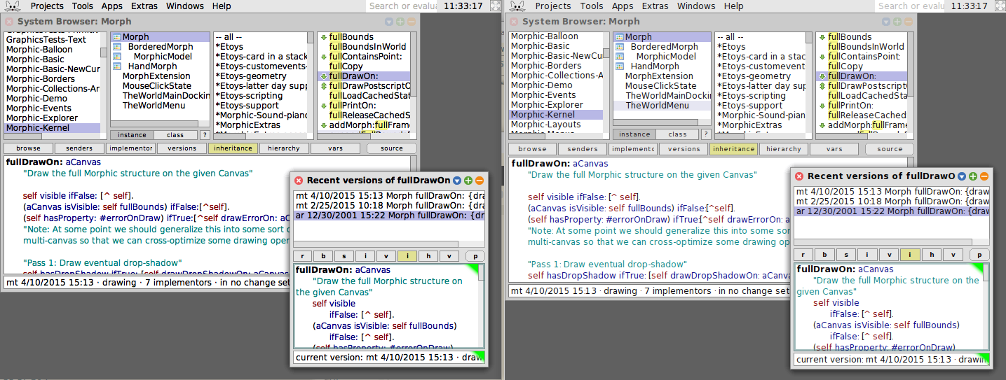
As you may have noticed, there was the commit "The Trunk: Graphics-topa.344.mcz". In it, Tobias shares with us the effortful results of improving the quality of our pre-rendered "Bitmap DejaVu Sans" font, which we use for everything: Source code, lists, buttons, balloon texts, ... See for yourself (left is current, right is previous):  Thanks very much for this, Tobias! Now, if you browse our "Font Size Summary" via the Help menu, you might also notice three additional sizes: "Bitmap DejaVu Sans #(7 9 12 14 17 20 )". Those can be used for High-DPI displays. You will also notice an additional font: Darkmap DejaVu Sans #(7 9 12 14 17 20 ) This is the same DejaVu Sans but pre-rendered as white font onto a dark background to account for correct sub-pixel anti-aliasing. So, this font should be used if you work with bright fonts on dark backgrounds. Also, take a look at "bold", "italic", and "bold italic". :-) Have fun! Best, Marcel |
Re: Improved rendering of our "Bitmap DejaVu Sans"
|
Hurray. The tiny size of . and : was really a big pain in the old version. Thank you Tobias for fixing this Best, Karl On Fri, Jun 10, 2016 at 11:11 AM, marcel.taeumel <[hidden email]> wrote: Hi, there. |
|
Awesome! :) -- On Fri, Jun 10, 2016 at 12:23 PM karl ramberg <[hidden email]> wrote:
|
Re: Improved rendering of our "Bitmap DejaVu Sans"
|
In reply to this post by marcel.taeumel
Here is the code that Tobias wrote and used to render the fonts under Mac OS X using Quartz and Freetype: https://github.com/krono/Squeak-Fonts Best, Marcel |
Re: Improved rendering of our "Bitmap DejaVu Sans"
|
In reply to this post by marcel.taeumel
I prefer Juan's version, because it's free of aliasing artifacts, which
are clearly visible and are quite annoying in freetype's output. Have a look at the attached image to see the difference. Levente On Fri, 10 Jun 2016, marcel.taeumel wrote: > Hi, there. > > As you may have noticed, there was the commit "The Trunk: > Graphics-topa.344.mcz". In it, Tobias shares with us the effortful results > of improving the quality of our pre-rendered "Bitmap DejaVu Sans" font, > which we use for everything: Source code, lists, buttons, balloon texts, ... > > See for yourself (left is current, right is previous): > <http://forum.world.st/file/n4900330/new-squeak-font-rendering.png> > > Thanks very much for this, Tobias! > > Now, if you browse our "Font Size Summary" via the Help menu, you might also > notice three additional sizes: "Bitmap DejaVu Sans #(7 9 12 14 17 20 )". > Those can be used for High-DPI displays. > > You will also notice an additional font: Darkmap DejaVu Sans #(7 9 12 14 17 > 20 ) This is the same DejaVu Sans but pre-rendered as white font onto a dark > background to account for correct sub-pixel anti-aliasing. So, this font > should be used if you work with bright fonts on dark backgrounds. > > Also, take a look at "bold", "italic", and "bold italic". :-) > > Have fun! > > Best, > Marcel > > > > -- > View this message in context: http://forum.world.st/Improved-rendering-of-our-Bitmap-DejaVu-Sans-tp4900330.html > Sent from the Squeak - Dev mailing list archive at Nabble.com. > > |
Re: Improved rendering of our "Bitmap DejaVu Sans"
|
On Fri, Jun 10, 2016 at 1:29 PM, Levente Uzonyi <[hidden email]> wrote: I prefer Juan's version, because it's free of aliasing artifacts, which are clearly visible and are quite annoying in freetype's output. - Bert - |
Re: Improved rendering of our "Bitmap DejaVu Sans"
|
In reply to this post by Levente Uzonyi
Hi Levente, Juans's version have a poor contrast value. Hence, I prefer Tobias'/Freetypes version although a little bit fuzzy on low-dpi screens. Best, Marcel |
Re: Improved rendering of our "Bitmap DejaVu Sans"
|
In reply to this post by Bert Freudenberg
> On 10-06-2016, at 5:10 AM, Bert Freudenberg <[hidden email]> wrote: > > On Fri, Jun 10, 2016 at 1:29 PM, Levente Uzonyi <[hidden email]> wrote: > I prefer Juan's version, because it's free of aliasing artifacts, which are clearly visible and are quite annoying in freetype's output. > > I agree Juan's looks more crisp, but also more delicate. Tobi's version appears stronger, so to me it improves the overall readability. Unfortunately on my iMac screen viewing the Pi via xrdp it makes for an effect a little like the old vga lcd screens when the contrast setting wouldn’t quite work. It’s survivable but not ideal for this case; I like the more visible small punctuation but prefer the crispness of the old version. Whilst looking through the other fonts available for comparison I was little disappointed at how most of them look. I think we’re in a hard spot right now since some machines (Pi, old laptops etc) have relatively low resolution display capabilities (although Pi can manage ~2000@~1500 kind of size) whereas nice new iMacs do ~5000@3000. That’s always going to be a pain to cover with bitmap fonts. Maybe we might provide for larger screen/faster machines to actually use anti-aliased fonts via Pango? tim -- tim Rowledge; [hidden email]; http://www.rowledge.org/tim Computer and car salesmen differ in that the latter know when they are lying. |
Re: Improved rendering of our "Bitmap DejaVu Sans"
|
In reply to this post by marcel.taeumel
> As you may have noticed, there was the commit "The Trunk:
> Graphics-topa.344.mcz". In it, Tobias shares with us the effortful results > of improving the quality of our pre-rendered "Bitmap DejaVu Sans" font, > which we use for everything: Source code, lists, buttons, balloon texts, ... > > See for yourself (left is current, right is previous): > <http://forum.world.st/file/n4900330/new-squeak-font-rendering.png> > I prefer right, by far :( Stef |
Re: Improved rendering of our "Bitmap DejaVu Sans"
One could still think about providing the former light rendering of Bitmap DejaVu Sans. Then you could choose depending on your display. Best, Marcel |
Re: Improved rendering of our "Bitmap DejaVu Sans"
|
In reply to this post by Stéphane Rollandin
Am 10.06.2016 um 22:33 schrieb Stéphane Rollandin:
>> See for yourself (left is current, right is previous): >> <http://forum.world.st/file/n4900330/new-squeak-font-rendering.png> >> > > I prefer right, by far :( > Same here on my laptop 17'' 1600 by 900, maybe I feel different on my HD Monitor which I'll see again in a week. Cheers, Herbert |
Re: Improved rendering of our "Bitmap DejaVu Sans"
|
Agree with everything written in this thread from the pictures. Now
I've just updated and, upon working with it for just a short time, I must admit I'm struggling with the boldness and seeming lack of crispness.. It reminds me of an old typewriter when the ink was getting low. Observe the riser of the lowercase d, how light it is relative to its bottom half.. On Sat, Jun 11, 2016 at 1:28 PM, Herbert König <[hidden email]> wrote: > Am 10.06.2016 um 22:33 schrieb Stéphane Rollandin: >>> >>> See for yourself (left is current, right is previous): >>> <http://forum.world.st/file/n4900330/new-squeak-font-rendering.png> >>> >> >> I prefer right, by far :( >> > Same here on my laptop 17'' 1600 by 900, maybe I feel different on my HD > Monitor which I'll see again in a week. > > Cheers, > > Herbert > |
Re: Improved rendering of our "Bitmap DejaVu Sans"
I probed some colors of our previous thinner DejaVu Sans rendering, and if you render black text, there are no black pixels in it. The darkest I could find was (0 0 9) in RGB. Most of them where (16 16 17), (24 12 16), or even brighter. I know that this is related to subpixel-AA but this explains my concerns about contrast. Sure, if you render black text on white background, you got used to not seeing black pixels at all. You can still produce a similar effect by changing black text color to the values mentioned above. Best, Marcel |
Re: Improved rendering of our "Bitmap DejaVu Sans"
|
On Sat, 11 Jun 2016, marcel.taeumel wrote:
> Chris Muller-3 wrote >> Agree with everything written in this thread from the pictures. Now >> I've just updated and, upon working with it for just a short time, I >> must admit I'm struggling with the boldness and seeming lack of >> crispness.. >> >> It reminds me of an old typewriter when the ink was getting low. >> Observe the riser of the lowercase d, how light it is relative to its >> bottom half.. >> >> On Sat, Jun 11, 2016 at 1:28 PM, Herbert König < > >> herbertkoenig@ > >> > wrote: >>> Am 10.06.2016 um 22:33 schrieb Stéphane Rollandin: >>>>> >>>>> See for yourself (left is current, right is previous): >>>>> <http://forum.world.st/file/n4900330/new-squeak-font-rendering.png> >>>>> >>>> >>>> I prefer right, by far :( >>>> >>> Same here on my laptop 17'' 1600 by 900, maybe I feel different on my HD >>> Monitor which I'll see again in a week. >>> >>> Cheers, >>> >>> Herbert >>> > > I probed some colors of our previous thinner DejaVu Sans rendering, and if > you render black text, there are no black pixels in it. The darkest I could > find was (0 0 9) in RGB. Most of them where (16 16 17), (24 12 16), or even > brighter. I know that this is related to subpixel-AA but this explains my > concerns about contrast. Sure, if you render black text on white background, > you got used to not seeing black pixels at all. You can still produce a > similar effect by changing black text color to the values mentioned above. effect is what people don't want to see. Please take a look at this picture again: http://forum.world.st/attachment/4900350/0/fonts.png . The vertical aliasing is just bad. I picked the E because it's easy to see it on that letter, but all letters have the same problem. Levente > > Best, > Marcel > > > > -- > View this message in context: http://forum.world.st/Improved-rendering-of-our-Bitmap-DejaVu-Sans-tp4900330p4900538.html > Sent from the Squeak - Dev mailing list archive at Nabble.com. > > |
«
Return to Squeak - Dev
|
1 view|%1 views
| Free forum by Nabble | Edit this page |


